Category Archives: Transformation Project

The idea for this project in my Designs for Learning Art class is for me (the student) to experience the artistic process in relation to my own life, passions, and inner imaginings. It should be inspired by a transformation I would like to have; personal or professional. Exploring different art mediums is encouraged and documentation of the process is a must…. hence the blog ;)

Oops, I forgot one.

The following images came out of my quick write activity. You can probably see influences of the quick write in the GIMP images I played with too.

I created an image of a stomach as a visual representation of the jittery feeling I get in my gut when I feel anxious or stressed… Subsequently, I didn’t experience an of that in the creation of this piece 🙂 It’s a very pleasant process.

This is a form of stenciling. I haven’t done much research on the matter but I heard once that it is a technique used by certain Inuit Nations. In the process, you cut a stencil and colour around the outside of it with. In my example, I used chalk pastel but I have also used  oil pastel. Other alternatives would be conte, charcoal, or any other smudgable substance.

stomach pic

This is the final image. Can you guess how it’s made?

stencils

Stencils are cut first. Then you colour around the edges of the stencil. Place it on your paper and smudge inwards so that residue from your drawing implement smudges onto the paper. In this example I used the negative space stencil but you can also use the positive stencil and rub outwards. W word of caution: Be careful about the underside of your stencils. Sometimes they get messy and it can transfer to your good paper if you aren’t careful.

Transformation Image – Study of Line and Contrast

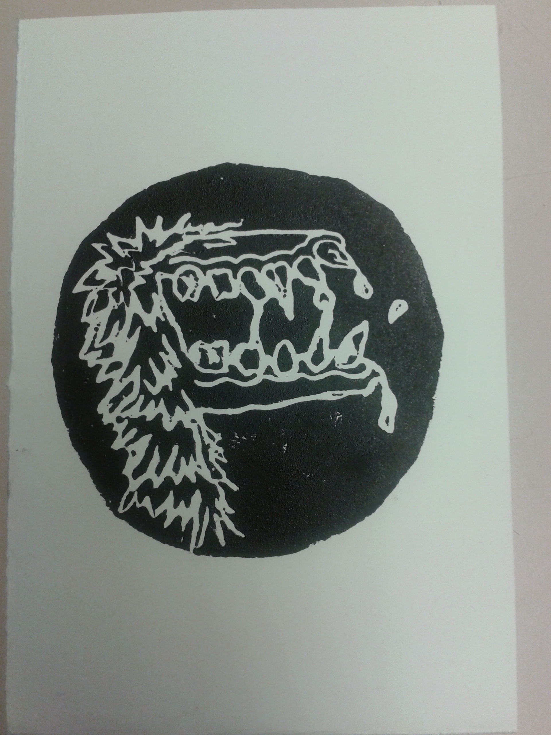
Ok, so I found that when I tried to recreate an idea in my head on GIMP shop, I was getting very frustrated as my limited knowledge didn’t allow me to manipulate the image the way I had intended. So I tried something new. I started by writing all the elements of art on little pieces of paper and put them in a hat. Then I blindly picked one (line). Next I did the same with the principles of art. I ended up picking contrast. So my self assignment was to create an image which explores both line and contrast in such a way that the process doesn’t cause my extreme anxiety but the content evokes anxiety in the viewer.

This is what I came up with.

ununified

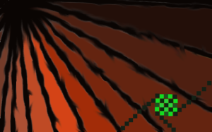
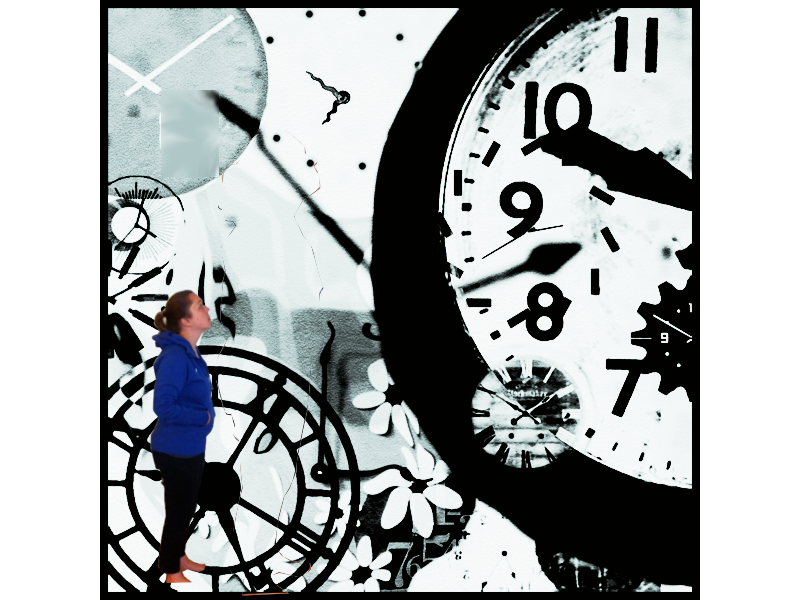
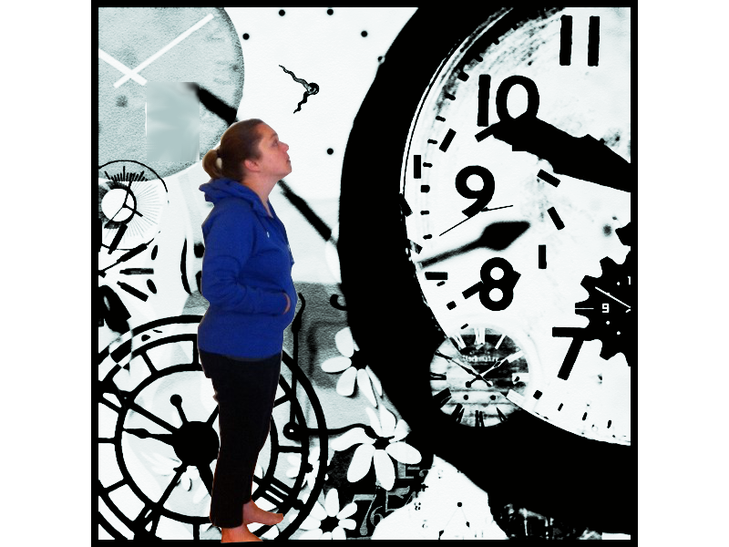
In this image organic lines converging at the top left corner direct the viewers attention to the starkly contrasting geometric pattern in the bottom right. I chose these colours as they contrast each other and are somewhat difficult to look at in hope that the viewer would experience mild anxiety.

The process for me was much less stressful and I was able to learn about the smudge effect, how to implement straight lines using various tools (paintbrush, pencil, smudge, eraser, etc.) I explored how using the zoom in and out options in the view tab allow you to fix minor problems as you are able to zoom in to individual pixels.

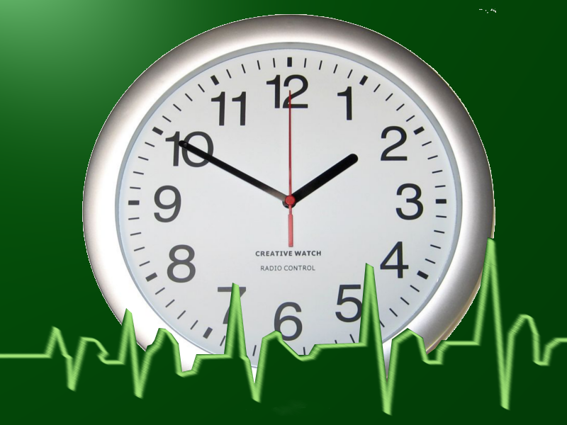
I’m much happier with this one compared to the previous clock image which was a good learning process but an embarrassment to my artistic abilities. It totally looks like a 1980’s album cover for some crazy techno band…yuck!

Artist Statement

I was inspired to explore the ins and outs of anxiety through my process of art making as well as the content of my image.

In this image I was trying to portray my feelings of anxiety through the imbalance between the organic and the geometric, the opposing colour schemes and the shapes created in the negative spaces between the lines. I hope the audience can look at the image and can think or reflect about the imbalance and the anxiety or stress that is caused by the contrast between the organic and geometric lines and shapes.

One significant artist choice I made before creating this image was to gain inspiration in an experiential way by letting my inspiration unfold as I actualized the content of the image.

A major challenge that I repeatedly struggled with was my limitations using new technology and processes. My skills in image manipulation using the GIMP software aren’t developed enough to actualize my intentions. To deal with this struggle, I broke down the ideas I had for content and approached them in a more basic way using the elements and principles of art and design to show stress between contrasting elements.

I originally chose to use this software program to try and learn a new process. I attended tutorials about the software and practiced on my own. Through trial and error, I learned about many of the tools and functions available through GIMP shop though generalizing these functions from one image to another was sometimes a difficult task.

One of the strengths I have come to realize about myself through this process is my ability to reflect and adapt. Originally, my ideas seemed to outshine my abilities and this created great anxiety in me. Through my reflective practice however, I was able to step back and adjust my image development strategy so that I was dealing with manageable learning objectives each time I began a new image. This process allowed me to deal with my frustration so that learning could continue.

Free write strategy

Sometimes when I’m looking for inspiration or when I am trying to get my students inspired I will do a short free write activity. This involve sometimes choosing a topic and setting an alarm for a short amount of time. I usually don’t go more than 2 or 3 minutes. Then I write whatever comes to mind. The pencil can’t stop writing and if I get stuck, I write the topic until I think of something to write or I doodle a bit. Sometimes for my students I will give them 4 or 5 options of starters to get them going. For example, if the topic was bullying, I might give them the following starters. 1) Bullying is…. 2) When I am bullied I feel…. 3) When I see bullying I feel… 4) Bullies are… 5) I am… This might put them in the right direction and if they stumble they can move on to the next starter.

After the 2 minutes are up, I reduce the words to the ones I think are most important. Here is what I came up with.

free write

New Approach!

OK, so I’ve realized that my GIMP shop time needs to be kept to small managable sizes or else I am likely to blow. I figure as I learn each of the tools slowly, I’ll become more comfortable with the software and hopefully can spend more time playing around. Until then, I’ll post all the Images I make. Here is the last one.

Transform Clock2 v1


It’s quite literal in content but with this image I was learning how to use filters and effects. I used a light and shadow filter to achieve the glossy look to the background, which ideally would match up more with the highlights on the clock. I also used the merge down function to put the image together.

Oh my goodness!!!

I have been playing around on GIMP shop now and am ready to throw my computer across the room. I NEED a break but before I go. Here are the things I’ve come up with. I’m not yet happy with them and will return after I’ve cooled down.

Transformation2

Similar to the last one but with the portrait selected and scaled down. Unfortunately, I somehow managed to apply a filter to the portrait and can’t figure out how to remove the filter.

shadow hands v1

In this one I have cut a big portion and used the smudge tool to create the dreamlike haze in the bottom right corner.

Talk about anxiety!!! GIMP

Phew… GIMP shop can be a cruel mistress… Though I think allowing myself time to play around with it to figure out all the tools is the best way to surpass the anxiety that computer programs generate in me.

Here is my first image attempt for the transformation project. This is still very new to me but it will hopefully show my progress after I have practiced and uploaded more tries.

Transformation1

I really got to know the free select tool with this image as I was trying to crop one image (the self portrait) and place it in top of another layer (the clock image). I also used the transform image tool to re-size and move the portrait. I am going to speak with Bill tonight in class and will hopefully get some tips on navigating the layers as this seems to be one of my weaknesses.

Anxiety Study 3 – My Desired Reaction

In this image I used a process that is somewhat familiar and somewhat novel. Relief printing is something I have done many times and really enjoy. The blue stingray on the homepage of this site is an example of a lino cut print I did as a demo in practicum.

Printing on Styrofoam plates however, is something I have never done before. I eased into the activity with little anxiety but had a few moments of apprehension throughout the process. The first one being about how much pressure to apply when making the plate and how detailed the lines would be printed. The second time occurred during printing when I was worried I would accidentally get extra ink on my page because my hands were messy. After printing I came to realize the amount of detail that can be expected when printing with Styrofoam. This will no longer cause me anxiety as I am aware of the process. I also remembered a trick I used to use in art school to keep your paper clean. Fold a small rectangle of card stock in half to use like a pair of tongs to lift the corners of your paper off the plate. This way your dirty hands only come in contact with the card stock and not the paper.

Screamer


The content of this image also speaks to my, sometimes, desired reaction to the anxiety I feel. I call it, “Screamer”. In certain situations, like when I feel I am going to be late for something, my anxiety mounts so quickly that I feel the extreme need to scream though I rarely, if ever, do. It is a gruesome feeling and I don’t like how I feel when this happens so I felt a monstrous depiction was warranted.

My First Attempt at GIMP shop

Here is my first try. It is pretty simple but I had a lot of fun and learned a surprisng amount. I will definitely need to take more time to tinker with it to become more comfortable.

For this image, I downloaded 2 separate images for the internet, one of a clam and one of an otter swimming in the ocean. I used these images to create the initial 2 layers.

By using the alpha function, I was able to isolate the image of the otter by cutting out the background.

I inverted the image of the otter and placed it over the mouth of the clam.

Next I was able to create the speech bubble by drawing a circle and using the lasso function to create the V that emerges from the circle. I erased the lines that separated the two and filled in the shape with the bucket tool.

Adding text was a challenge as I had forgotten about the importance of the hierarchy structure in the layers. After figuring out this problem with the instructor, I was able to implement the text.

And… voila! the otter-clam was born.

I am excited to try out these new image development strategies again along with adding filters and manipulating colour.

otter clam (1)

Anxiety Study 2 – Physical Representation – Acrylic paint on paper

In this study, much like the first two, I was focusing on a visual representation of the physical feelings I get when I am anxious. Again, this represents the growing knot in my belly.

Transformation 3 – black knot

Anxiety Study 1 – Physical Representation – pen on paper

As I started to think about how to visually represent anxiety, I tried to imagine how it felt to me and what that might look like. I can usually feel anxiety in the pit of my stomach like a hug knot that grows and eventually explodes. These two images came out of this visualization process.

Click on the links and the images will appear in the same tab. Use your browsers back button to return to this page.

Transformation 1

This is the 1st one but there was something about it I didn’t like.

Transformation 2

So I tried again.