Author Archives: Martha

I am a passionate educator, an active artist, a scuba diver, and an otter enthusiast.

Talk about anxiety!!! GIMP

Phew… GIMP shop can be a cruel mistress… Though I think allowing myself time to play around with it to figure out all the tools is the best way to surpass the anxiety that computer programs generate in me.

Here is my first image attempt for the transformation project. This is still very new to me but it will hopefully show my progress after I have practiced and uploaded more tries.

Transformation1

I really got to know the free select tool with this image as I was trying to crop one image (the self portrait) and place it in top of another layer (the clock image). I also used the transform image tool to re-size and move the portrait. I am going to speak with Bill tonight in class and will hopefully get some tips on navigating the layers as this seems to be one of my weaknesses.

Week 9 – GIMP shop Tutorial (note – This one is out of order)

GIMP/Photoshop tutorial

Today in class, we had a step by step tutorial on GIMP (GNU image Manipulation Program) which is the open source version of Adobe Photoshop. As I understand, both are quite similar and everything I have learned on GIMP can be applied to Photoshop. In the tutorial, Bill, or instructor, took us step by step through the tools and showed us how to use and manipulate images. For the sake of this reflection, let’s assume that I am teaching a grade 11 photography class this digital photo process for the first time. To hook the students into the lesson I would show them a multi-coloured relief print but I wouldn’t tell them what it was or how it was made. I would pass out examples so that students could touch the print and have a close look. The students would be asked to talk in pairs or small groups about how they thought the image was made. We would open up the conversation to the whole class. This discussion is important because multi coloured relief prints are based on the idea of layering different sections of an image over top of each other just like GIMP. To slowly ease the students into the program, I would hook my computer to a projector so I could show the students step by step processes that are pivotal to the use for the program. For example, layer hierarchy, layer selection, the alpha function which allows you to make a layer transparent of translucent and some of the selection tools and filters. As I am giving the very teacher centered tutorial, the students would be following along with a hand out that I had created. The handout would be made by taking screenshots of the program and the students would be asked to fill in the blanks with the names of specific functions as I discussed them. This combination of visual, tactile, and auditory learning would hopefully solidify this sometimes difficult information for the students. This whole process would likely take about 30 min so following this we would head to the computer lab so the students can move around, stretch their legs and explore the program themselves.

The objective for this play/exploration time is to a) allow the students to get comfortable with the program and b) analyze the use of image development strategies. This second objective is a direct PLO from the grade 11 studio arts IRP.

The students would be given the rest of the class to explore the program. There would be no stipulations on using certain functions or processes. As the students are working, the teacher is circulating and helping out where needed.

Students would be reminded to save their image as we would return to it in the following class. At the beginning of the next class we would go straight to the computer lab to get started. Students would get 20 minutes to touch up anything on their image. As an extension for those who decided they were happy with their original image, students would be asked to take a self portrait with the computer’s camera and would be given a hand out with specific instructions. For example, change your eye colour to match your shirt or give yourself a pet parrot. This handout would focus on important aspects of the previous class’s tutorial.

As the students are finishing up, I would choose 2 or 3 example images that I had made the day before. As a class we would analyse the sample work for its use of image development strategies. After analyzing the images as a class, students would be put into groups of 3 and asked to visit each of their computers to discuss the processes that they used and explored. Just before the end of the class, students would be asked to complete a formative/summative exit slip which focuses on questions they might have, problems they ran into, possible solutions for those problems they might have discovered through the class and group discussions and specific image development strategies.

Students would be assessed based on their image development strategy answers and the following class would be designed to answer the questions that students wrote on their exit slips.

otter clam (1)

Here is the image I created in the tutorial with Bill. First, I found an image of an otter. I isolated the otter using the cut function and deleted the background section of the image. Next, I found an image of a clam. I went back to the layer with the otter and inverted the image applying the alpha function and placed the inverted otter on top of the clam image so it appeared to be coming out of the mouth of the clam. Next I created a new layer to work on the speech bubble. I drew the bubble using the circle tool, erased the bottom right side and connected it with pencil tool. Following that I inserted text which proved to be way more difficult than I had previously thought.

Having someone help you is very beneficial but the key component I learned from this lesson was exploration. I found I learned better when I was given time to experiment with the tools on my own. This is why in a classroom, I would like to create a safe environment which is forgiving and allows the students opportunities to try without being scrutinized for failure.


Portfolio Reflection

At the end of my 401/402 semester my faculty associate had me reflect on my own personal artistic values for my students and myself. The key things I came up with were to create good relationships incorporating community. I always want to be transparent with my students so they understand why these values are important. Art teachers need to be engaging and to do so can follow a difficult activity with an easier more enjoyable one.  I think it is important to promote individuality and personal voice though also fostering acceptance and empathy. As the teacher, I need to let the students have fun and allow them to break a few artistic rules along the way.

As I continued classes through this last semester my philosophy and approach to art education has grown considerably. Three of the areas that I feel have developed since the beginning of the designs for learning art class are inclusion in the art room, community and place based education as well as assessment.

When I was in my practicum, I took differentiated lessons very seriously, making adaptations for students who required different tools to feel successful. I had a student in my art 9 class who attended the class with an educational assistant whom I discussed his IEP with and made small activities for him so he could be art making in class too though I wasn’t focused on him being able to communicate with his art. Often the lessons were simple step by step processes that gave him something to do but didn’t really encourage him to express his feelings or ideas.  I admit that on occasion, I would see the EA helping or to be more specific, doing the art projects for him if they were too difficult. I assumed that the EA would tell me how to teach him. After week ten of this semester, I came to a realization that I will carry with me into my career. As the classroom teacher, he was my student, not the EA’s. It was my responsibility to find out explicitly, what types of activities he could do and how activities could be adapted for him to feel like he was expressing himself as opposed to just completing the steps of the differentiated lesson I had planned. As stated in the reading, The Art of Inclusion, “True inclusion means offering each student the opportunity to learn in a style and environment that maximizes his or her ability to fully develop as a human being.”  Equipped with this knowledge and a growing understanding of good inclusive practices, in the future, I will take more time to collaborate with life skills teachers on the methods that the students communicate. Using this information, I can design more fulfilling art activities that encourage more authentic communication. Doing this is also great modeling for other students in the class and encourages them to express themselves as well as appreciate others’ work and ideas.

Place based education is another burgeoning idea I have had this semester. I feel that as an art teacher, I have the unique opportunity to infuse the sometimes obscure ideas of privilege and power to students in the classroom. This year in PDP, we have been learning a lot about Aboriginal Education and one of the goals I have taken on as an educator is to decolonize education. One way I can see this possibility is through place-based education that focuses on immediate location to draw on connections that we have to the land. Current and historical connections can be assessed and in doing this I hope to encourage my students to use environmentally sensitive practices while appreciating different cultures and their ties to the land. “Art education framed by a critical pedagogy of place creates opportunities for students to engage in thinking and artmaking that considers vital questions about nature, place, culture and ecology.” If I can infuse my lessons with critical thinking, eco-justice, and acceptance (not tolerance) of different cultures, I feel like I will be able to open up educational doors for Aboriginal and non-Aboriginal students to learn about one another and appreciate each others’ strengths.

As a new teacher, assessment is always at the forefront of my development. Art teachers have a unique assessment opportunity that allows us to base our assessment on process instead of product. I think that curriculum reform is developing in other subjects to allow for this as well but somehow currently, it seems more acceptable in the art room.  Throughout both the portfolio project and the transformation project, Jan has impressed on us several times that it is not the product that she is interested in but the process and the thinking that went into them. This will be something that I stress to my students in my upcoming position as a grade 8 and 9 art teacher. This type of assessment practice will also help students who need differentiated instruction because it doesn’t require all students to create the same thing. It requires them to explore their thoughts and communicate their feelings through creation.  Eisner said, “What needs attention in assessment and evaluation is not only manifest of behaviour, but also the kind of thinking that went into the project”.  Some things I can do to encourage this are to have an ongoing sketchbook activity that allows students to keep track of their ideas in order to build upon them. Another thing I will do, which was recommended by Jan in class, is to ask the students to write a note to me before I assess their work which points out the things the student wants me to notice. I can also elaborate on that by asking the students to explain why it is important for them that I take note of these particular aspects.

Going into the workforce as a teacher is both exciting and scary but as long as I continue to reflect on my growing educational philosophies in inclusion, creating community through art, assessment practices and other areas, I will continue to grow as an artist, art educator, and lifelong learner. Professional development opportunities and collaboration with other educators will aid in this development as well as my own understanding of my students and the community I work and live in.

artistic values


Extra-art, My recent ceramics pieces

During my practicum I was teaching ceramics for the first time without ever having experienced a ceramics lesson. The classes went well but I thought I better learn a little about the subject in case I one day had to teach it again without the guidance of a mentor teacher. So during this semester I signed up for a ceramics class run through the roundhouse community center. We studied hand building using coils, pinch techniques, and slab as well as throwing on the wheel.

Here are some of the pieces I created.

platter This is a platter I built using a slab technique. I rolled out the clay using a rolling pin and laid the slab on a thick piece of foam. Then I used a piece of wood to apply pressure to the center of the clay slab. This creates the upturned corners. Next I used a stamp to create the oval texture. I glazed this piece with raspberry and black glaze simply dipping the bisque fired platter in the glaze bucket. After the glaze dried, I hand painted the black glaze in the textured ovals on the raspberry side. I am quite happy with the piece.

butterdish 1

butterdish 2

I also used the slab technique to make this butter dish along with the coil technique. The walls are made with slabs and the small lib on the bottom piece was made with coils. I glazed this piece with butterscotch and plum. One thing I would do differently next time would be to make all the sides of the piece and let it dry flat for a few days before assembling the walls. This will prevent sagging and warping.

maskHere is my old man mask. I really love the way he turned out! This could work as a 8-9 class unit on mask making in a ceramics class. For this guy I used a slump mold. This means I rolled out a slab of clay and slumped it over a balled up wad of newspaper covered in a plastic bag. The plastic bag prevents the newspaper from sucking the moisture out of the clay while you work on it. I also used embossing and engraving as reductive processes for the mask. I didn’t want to make any mistakes glazing the lask so I decided to glaze it all in clear.

honey pot

This is my wheel piece. It stands about 5 inches high and has thick walls. Working on the wheel was very challenging for em and caused a lot of frustration. Patients is needed and students may also become easily aggravated. One thing I found that was helpful was to close my eyes when trying to center the clay on the wheel. On this piece I used a cake icing tool to squirt little dots of slip near the top edge of the pot. This texture technique can be used to draw on texture too.

Week 11 – Ecological art

Exploring the connection between art and nature

In class this week we learned about ecological art and how it can connect the students to their immediate environment. While listening to Jan’s lecture, there were a few things that really stood out for me, the number and variety of environmental artists as well as the increased amount of female artists since the 1960s. I know the work of Andy Goldsworthy and Christo and Jean Claude quite well but Jan introduced us to a number of other artists that I had never heard of, Nancy Holt, Smithson, Richard Long, and Alan Wood. This week’s reading, “Art Ecology and Art Education” also introduced me to a number of new artists like Brandon Ballengee, Tiffany Holmes, and Kathy Pendergast. In a class, it would be nice to introduce many artists, females included,  so the students can see various ways to incorporate nature in their own art.

For our art making activities in class, we were asked to choose a place outside to create a curriculum activity that involves art making in groups of 4-5. My group walked to the edge of the forest and started planning. We discussed the many cyclical aspects of nature and the importance of relationships in nature. We decided to draw on the latter as we thought it was important to showcase nature’s many relationships and how humans can and should have healthy relationships with nature as well.

For the purposes of this reflection, let’s assume I am teaching this to a grade 9 art class. For assessment of this lesson, I have chosen to focus on 2 different PLOs that have cross curricular value. That being said, this lesson could also be used in a drama 9 class. The PLOs are as follows; Art 9 – Make images in art that solve complex design problems considering form and function. Drama 9 – Make movement choices that create a specific effect.

The activity would be run similarly to how my group mates and I did it in class with a few adaptations. First we would need to scaffold this activity with a lesson on natural relationships. This could start by asking the students what they already know about the topic. As a formative activity, I would use the graffiti wall strategy. Each student would be given 2 or 3 sticky notes and would be invited to take more if they would like. On the sticky notes, students would write about a specific relationship in nature that they find particularly interesting. Some examples might be, mosquitoes and water, as they are hatched in stagnant pools. Another might be wolves and rabbits; if we didn’t have wolves, the rabbit population would be out of control. The students would post their sticky note on a wall and take a look at the others posted.  We would follow this with a pair/share guided towards questions that might have come up from the graffiti wall activity.

Next is a community builder exercise I like to call nature’s web. The class of 30 would be broken up into groups of 5 -6. Students are handed a sticky note with an element from nature written on it, for example; rocks, worms, mushrooms, water, flowers, bees and a ball of yarn. Then they have to pass the yarn to another person in the group while explaining a relationship that exists between the two.  A web will be created as the yarn can be passed to the same person multiple times but must be passed to everyone at least once.

Next students will pair up and create a physical representation of a relationship or problem that exists between the 2 elements in nature. Students can choose to work with the element they previously used in the web activity or can choose a new one. The form of their body must be considered in the representation.  Movement must be used to exemplify the element they are working with. Sound can be incorporated to add function to your representation.

Pair performances are held for the class and we discuss them.

And finally, students are put in groups of 5-6 again and asked to create one visual representation of relationships that exist between all of the partners.

Again we have a discussion, students can guess what the performance was about.

Here is a photo of representations my class mates created.

pic 1

A seagull, rock, waves, and wind.

Anxiety Study 3 – My Desired Reaction

In this image I used a process that is somewhat familiar and somewhat novel. Relief printing is something I have done many times and really enjoy. The blue stingray on the homepage of this site is an example of a lino cut print I did as a demo in practicum.

Printing on Styrofoam plates however, is something I have never done before. I eased into the activity with little anxiety but had a few moments of apprehension throughout the process. The first one being about how much pressure to apply when making the plate and how detailed the lines would be printed. The second time occurred during printing when I was worried I would accidentally get extra ink on my page because my hands were messy. After printing I came to realize the amount of detail that can be expected when printing with Styrofoam. This will no longer cause me anxiety as I am aware of the process. I also remembered a trick I used to use in art school to keep your paper clean. Fold a small rectangle of card stock in half to use like a pair of tongs to lift the corners of your paper off the plate. This way your dirty hands only come in contact with the card stock and not the paper.

Screamer


The content of this image also speaks to my, sometimes, desired reaction to the anxiety I feel. I call it, “Screamer”. In certain situations, like when I feel I am going to be late for something, my anxiety mounts so quickly that I feel the extreme need to scream though I rarely, if ever, do. It is a gruesome feeling and I don’t like how I feel when this happens so I felt a monstrous depiction was warranted.

Week 10 – Printmaking

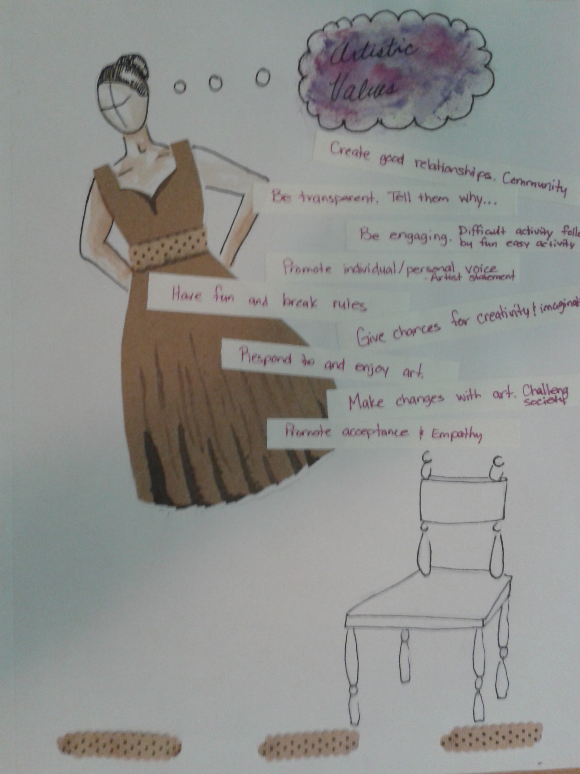
Printmaking Techniques

This week in class we learned about 4 different printmaking techniques that can easily be incorporated into the art classroom; lino cut relief prints, Styrofoam relief prints, stamping, and tape resists. Printmaking is a techniques where a matrix or plate is created and then multiple images can be pulled from the plate. When a set of images is pulled it is called an edition. Some types of prints however are examples of monotypes, where only one image is made. An example of this is a tape resist. I had never done a tape resist before and I learned a lot from the process.   For this reflection, let’s assume I am teaching the tape resist process to a grade 8 visual arts class.

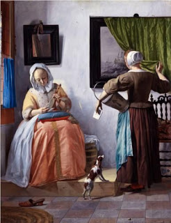
The theme or big idea of the lesson would be that artists can leave hidden messages in their pieces. As an introduction to this idea, we would look at some 17th century Dutch paintings which often display a painting within the painting. These images conveyed moralizing messages for the audience at the time by illustrating everyday scenes. However, in the scene, the viewer can read hidden messages through layered symbolism when reading the painting within the painting.

 woman reading letter

                                                            Woman reading a letter; Gabriel Metsu, 1664-1666

    man reading letter

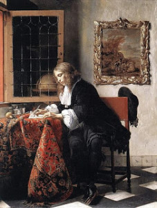
                                                                Man reading a letter; Gabriel Metsu, 1664-1666


Key vocabulary would be discussed in reference to these paintings such as symbolism, allegory, and embedded.

We would then brainstorm the idea of symbolism. One way to do this could be to show images of symbols that are common in today’s society; male/female bathroom signs, no smoking symbol, peace sign, heterosexual/ homosexual/ transgendered symbols, etc. We would then move on to some less obvious symbols that can be represented by some of the elements and principles of art and design. Colours, for example, have different cultural meanings and this would be discussed. We would discuss the implications of different line qualities and what they might symbolize. This could be dome in think/pair/shares or carousel questions where students rotate through different images or symbols that I have created and discuss what meaning they attach to it. There are no right or wrong answers to this activity as each person may attach a different meaning to a symbol based on their own personal experience.

After this, the students would have some sketchbook time where they individually brainstorm ideas of symbols that could represent them, their family, or their culture. To frontload this activity, I would ask they students to think about symbols that could represent a secret or a hidden message they would be willing to embed in their tape resist. I would explain that as the artist they have the artistic licence to completely embed or partially revel specific parts of their secret or hidden message. In the frontloading, I would show them the website postsecret.com. This is a website where people make small artistic postcard with their secrets embedded into the imagery or blatantly written out.

Next, the students would be introduced to the process of tape resists. I would show examples and ask if they know how the examples were made. In pairs the students would write an answer to the question, “why might tape resists be a good process for embedding secrets or hidden messages into an art piece?”  Their answer is handed in so I can determine if everyone is catching on to the idea of layering and revealing. This question acts as formative assessment for the PLO in the visual art 8 IRP which states; identify contributions of processes and technologies to the meaning of an image and evaluate the appropriateness of their use.

In the following class, students would be asked to begin their tape resist images with embedded messages. At the end of the class, students would complete a short exit slip asking the following questions;

1) What are 2 examples of symbols embedded in your piece? This can be an obvious symbol like a peace sign or something less obvious like a colour or line quality. (You do not have to tell me what the symbol stands for or represents to you)

2) Briefly explain the process of tape resists.

3) You already answered the question, “why might tape resists be a good process for embedding secrets or hidden messages into your artwork?” Please tell me if your answer has changed, why or why not?

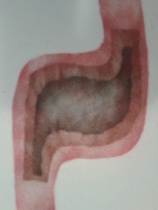
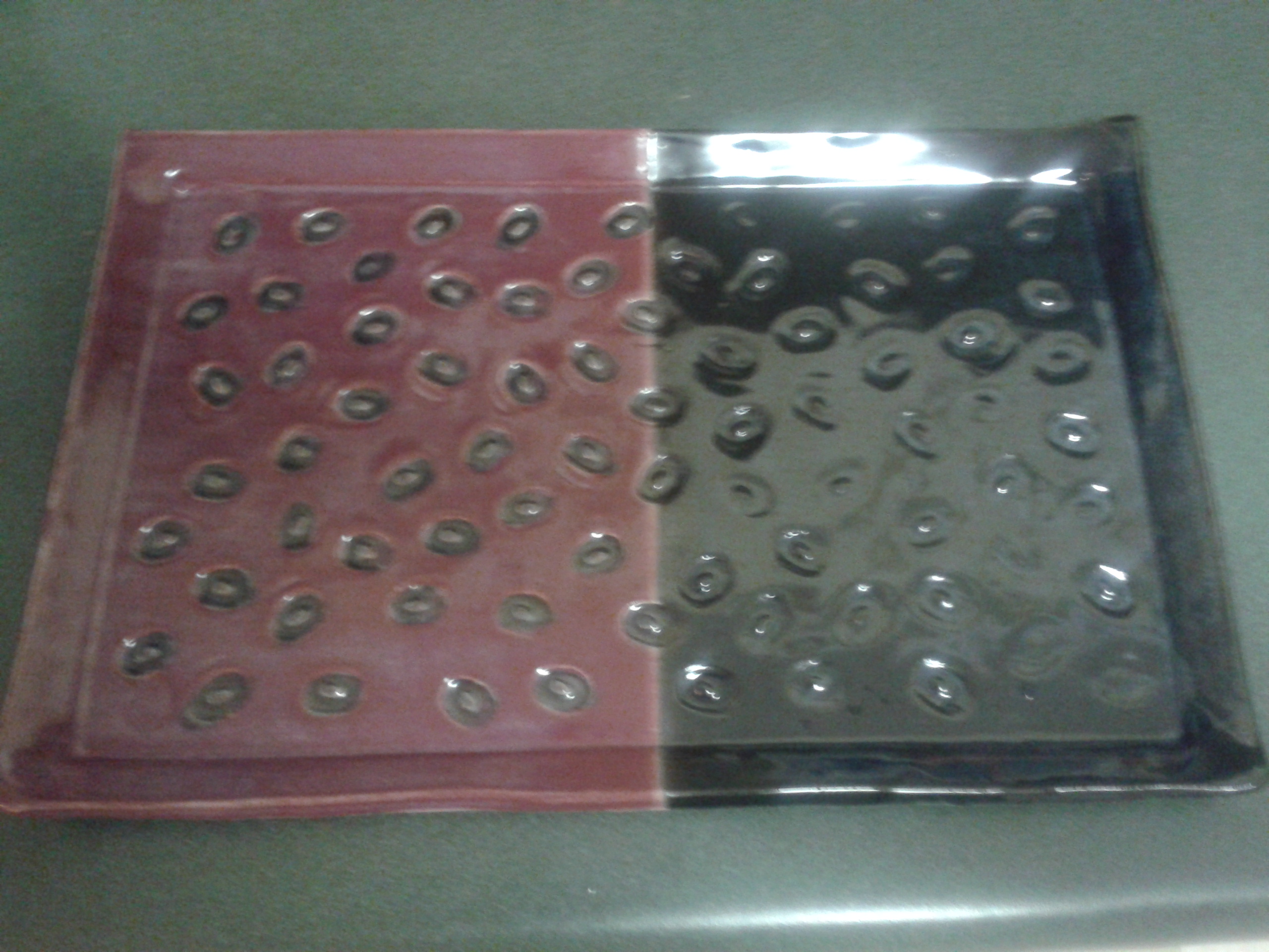
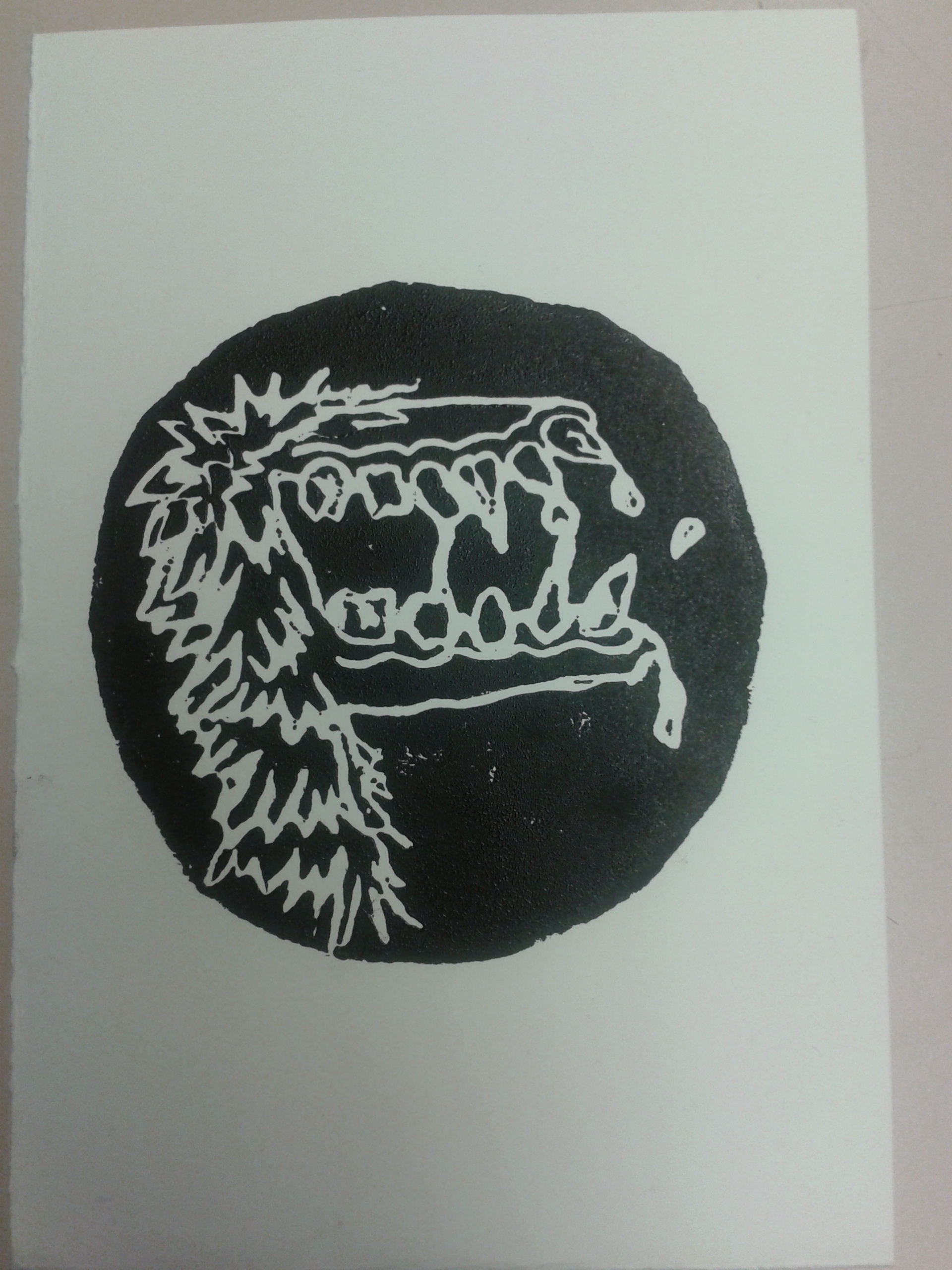
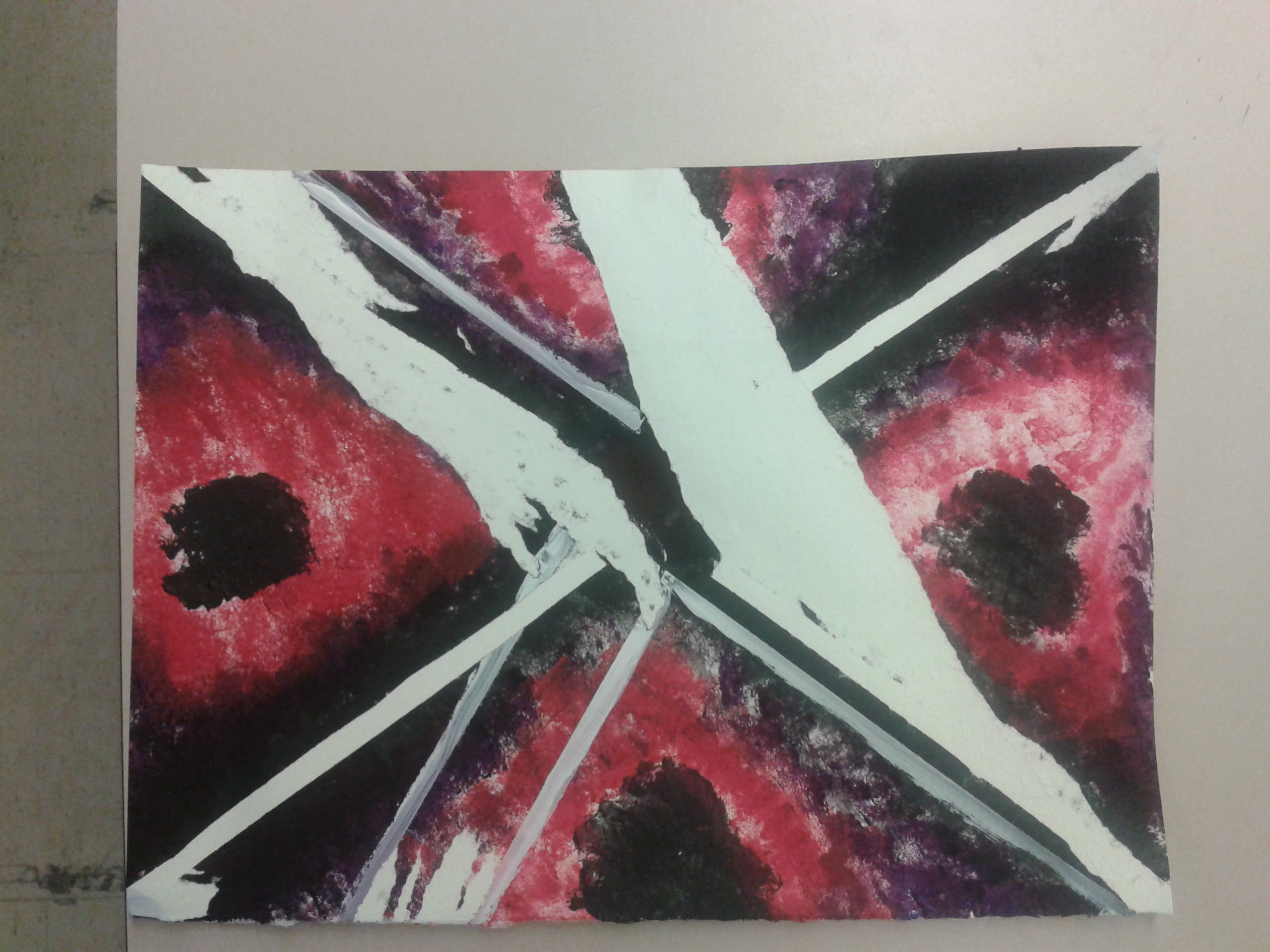
Here is an example of the tape resists I made in class and could use as an examples.

tape resist 1


In this one, I discovered a few important things about the process. If you use good quality masking tape, your paper may rip as the adhesive is too strong. Painter’s tape (the green kind) is suitable for the process. Another possible contributing factor the paper ripping  is the quality of paper used. I used printmaking paper which is lose and flexible. Try to use tightly compressed paper that is very smooth. Also, don’t get too impatient (like I did) make sure your paper and paint are completely dry.

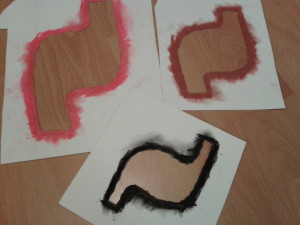
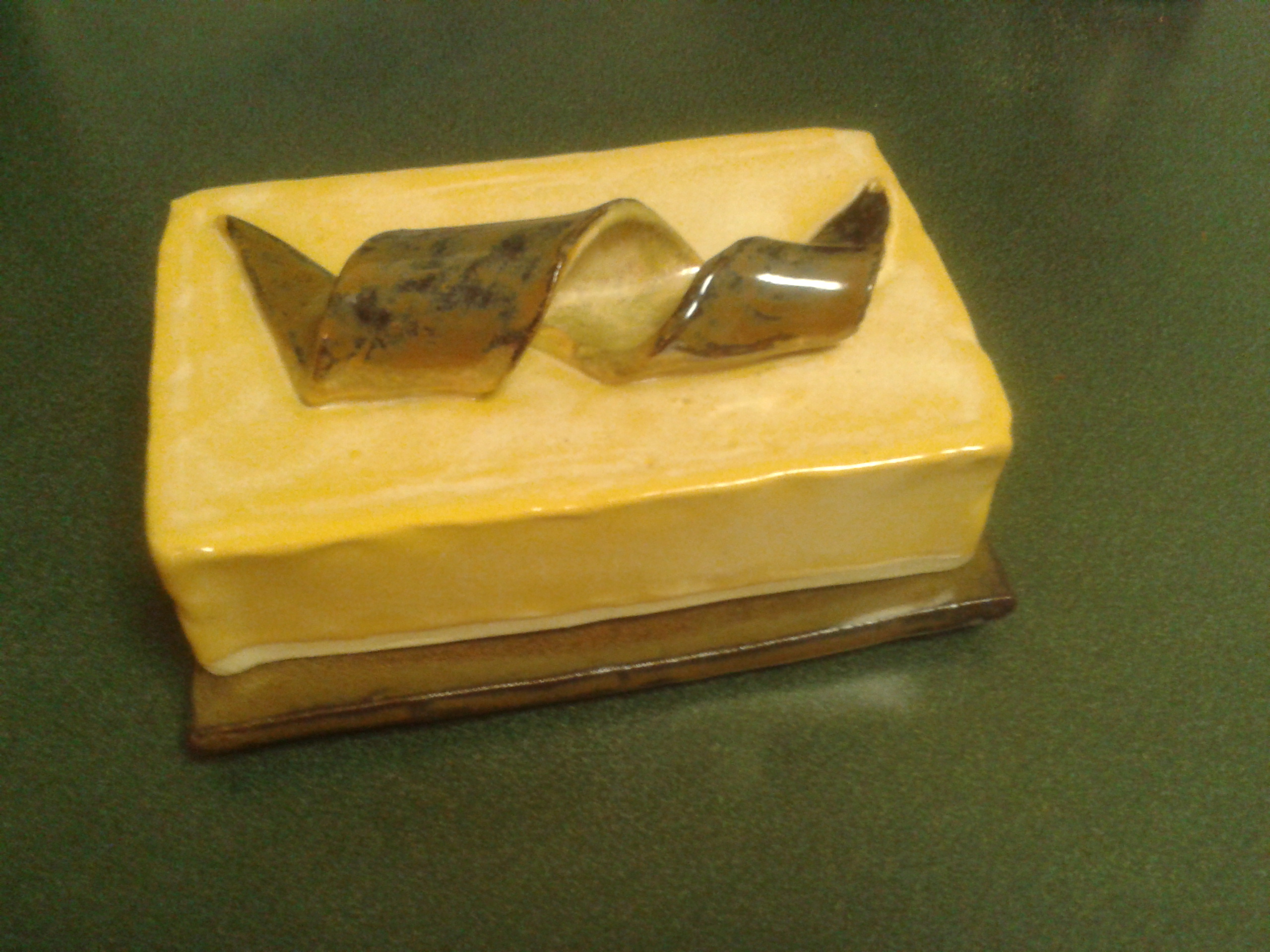
The following is another example of printmaking that we didn’t explore in class but I have used for my own personal art as well as in a life skills classroom. It is easily differentiated and can be collaborative or individual.

This is a form of stenciling. I haven’t done much research on the matter but I heard once that it is a technique used by certain Inuit Nations. In the process, you cut a stencil and colour around the outside of it with. In my example, I used chalk pastel but I have also used  oil pastel. Other alternatives would be conte, charcoal, or any other smudgable substance.

stomach pic

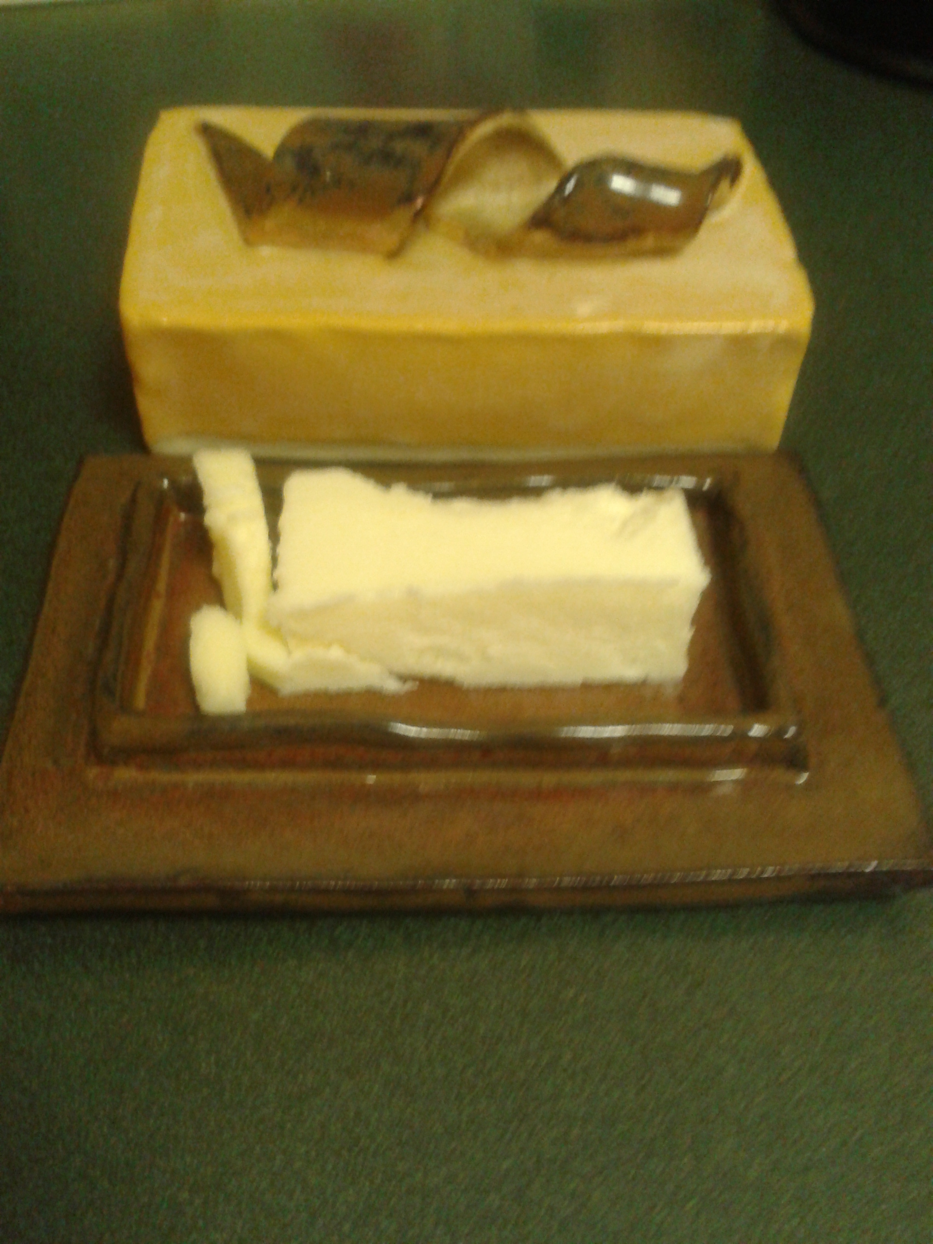
This is the final image. Can you guess how it’s made?

stencils

Stencils are cut first. Then you colour around the edges of the stencil. Place it on your paper and smudge inwards so that residue from your drawing implement smudges onto the paper. In this example I used the negative space stencil but you can also use the positive stencil and rub outwards. W word of caution: Be careful about the underside of your stencils. Sometimes they get messy and it can transfer to your good paper if you aren’t careful.

My First Attempt at GIMP shop

Here is my first try. It is pretty simple but I had a lot of fun and learned a surprisng amount. I will definitely need to take more time to tinker with it to become more comfortable.

For this image, I downloaded 2 separate images for the internet, one of a clam and one of an otter swimming in the ocean. I used these images to create the initial 2 layers.

By using the alpha function, I was able to isolate the image of the otter by cutting out the background.

I inverted the image of the otter and placed it over the mouth of the clam.

Next I was able to create the speech bubble by drawing a circle and using the lasso function to create the V that emerges from the circle. I erased the lines that separated the two and filled in the shape with the bucket tool.

Adding text was a challenge as I had forgotten about the importance of the hierarchy structure in the layers. After figuring out this problem with the instructor, I was able to implement the text.

And… voila! the otter-clam was born.

I am excited to try out these new image development strategies again along with adding filters and manipulating colour.

otter clam (1)

Anxiety Study 2 – Physical Representation – Acrylic paint on paper

In this study, much like the first two, I was focusing on a visual representation of the physical feelings I get when I am anxious. Again, this represents the growing knot in my belly.

Transformation 3 – black knot

Anxiety Study 1 – Physical Representation – pen on paper

As I started to think about how to visually represent anxiety, I tried to imagine how it felt to me and what that might look like. I can usually feel anxiety in the pit of my stomach like a hug knot that grows and eventually explodes. These two images came out of this visualization process.

Click on the links and the images will appear in the same tab. Use your browsers back button to return to this page.

Transformation 1

This is the 1st one but there was something about it I didn’t like.

Transformation 2

So I tried again.